A room with one remarkable window is both a gift and a test. The view does most of the work — the light, the depth, the sense that the room continues past its own walls — and everything else has to agree to play a supporting part. The trouble is that most of us furnish by habit: sofa against the longest wall, television opposite, a row of frames on whatever surface is left. Do that in a room with a serious view and the result is a quiet argument between the window and the furniture. The window usually loses.
The alternative is to treat the view as the room's anchor and arrange everything else in relation to it. That does not mean an empty room and a single chair facing the glass. It means a handful of deliberate decisions about sightlines, colour and light.
Read the window before you move a single piece of furniture
Spend a day with the room before you change anything. Sit where you would naturally sit, at three different hours, and notice what happens. Where does the light land at ten in the morning, and where does it glare at four? Which part of the view do you actually look at — the horizon, the rooftops, the trees on the left — and what does the frame crop out?
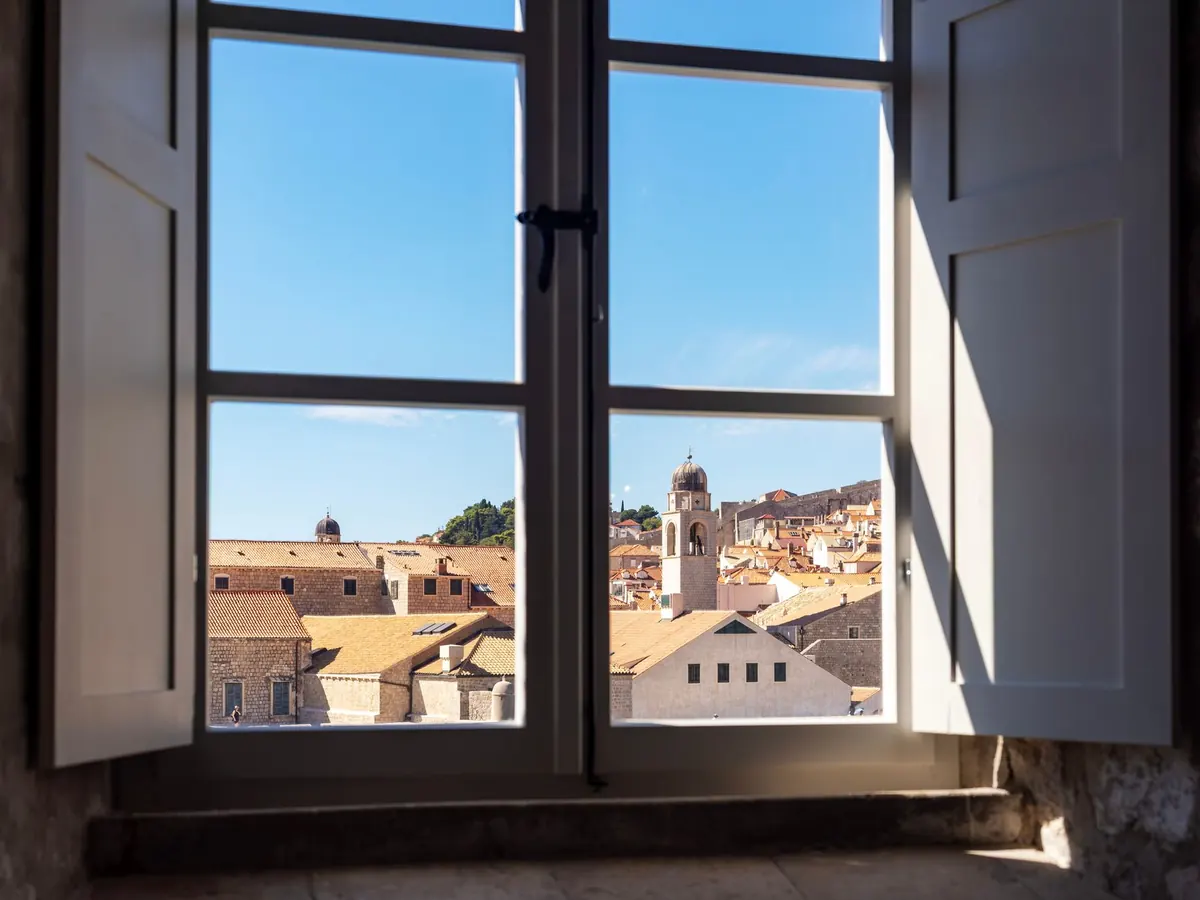
Two observations are worth writing down. The first is the horizon line, the strongest horizontal in most views. If it falls at roughly the height of your sofa back or sideboard, the furniture will cut across it and the view will feel sliced. The second is the palette outside. A view of plane trees and a grey street gives you different colours to work with than a view over terracotta roofs or open water. Photograph the room at three times of day and keep the pictures on your phone; they are far more useful than memory when you are standing in a shop.
Furniture layouts that give the window room to breathe
There are three reliable arrangements, and the right one depends on how absorbing the view is.
Facing the view. Chairs or a sofa turned toward the window, backs to an interior wall. This works when the view is genuinely the point — a landscape, a harbour, a long garden. Offset the seating slightly from the centre of the glass so nobody stares into the sun, and keep the backs low enough that people sitting behind can still see out.
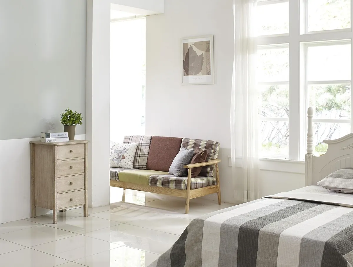
Perpendicular to the view. A sofa placed at right angles to the window is the most flexible option in most rooms. People can look out by turning their heads rather than their whole bodies, conversation still works, and a screen or fireplace on the opposite wall gets a fair share of attention.
The clear runway. Whatever you choose, protect one unobstructed line from the door to the glass. A room feels generous when you can walk toward the window without sidestepping an armchair, and mean when you cannot.
- Keep the sill and roughly half a metre in front of it clear.
- Choose low-backed chairs and sofas near the glass; tall pieces belong on interior walls.
- Leave the window wall mostly empty — no bookcases, no gallery of prints.
- Place the television on a wall perpendicular to the window, not facing it, to avoid a screen full of reflected sky.
- Let one chair sit slightly apart and angled toward the view. It will become the most fought-over seat in the house.
Colour: echo the view, or step back from it
Two approaches work, and they pull in opposite directions.
The first is to borrow from outside. Look past the obvious green or blue and find the quieter colours in the view — the grey-brown of bare branches in winter, the chalky tone of distant buildings, the slate of a wet roof — then use one of them on the upholstery or the rug. The room feels related to the landscape without looking themed.
The second is to go deliberately quiet: warm off-whites, putty, pale stone, soft greys. The view supplies all the saturation a room needs, and a calm envelope lets it do so. What nearly always fails is a strong, saturated wall colour immediately around the window. Deep red or cobalt next to the frame turns the glass into a bright rectangle fighting a bright wall. If you want a dark colour, put it on the wall opposite the window, where it makes the daylight read stronger by contrast.
Two small details matter more than they should. A ceiling in a pale, slightly warm white bounces daylight back into the room instead of greying it. And matching the window trim to the wall colour calms the frame; a crisp contrast draws a rectangle around the view, which is sometimes exactly right and sometimes one box too many.
Curtains and blinds that frame instead of fight
Window treatments are where good intentions go wrong most often. The instinct is to buy fabric wide enough to cover the glass. Do the opposite: hang the track or pole 20 to 30 centimetres beyond the frame on each side, and as high as the ceiling or cornice allows. Then the curtains, when open, sit on the wall beside the window and leave the whole view clear. When closed, they cover more than the glass, which makes the window feel larger rather than smaller.
Choose a sheer linen or fine cotton for daytime — enough to soften glare and screen an overlooked window without turning the view into a blur. Add a heavier layer only if you need warmth or privacy at night. Roman blinds inside the recess are a neat solution where curtains would crowd a small room, but check how much view remains when the blind is fully raised. Skip borders, swags and busy prints; near a good view, plain fabric in a tone from the room's palette is almost always the better answer.
Lighting for daylight, and for after dark
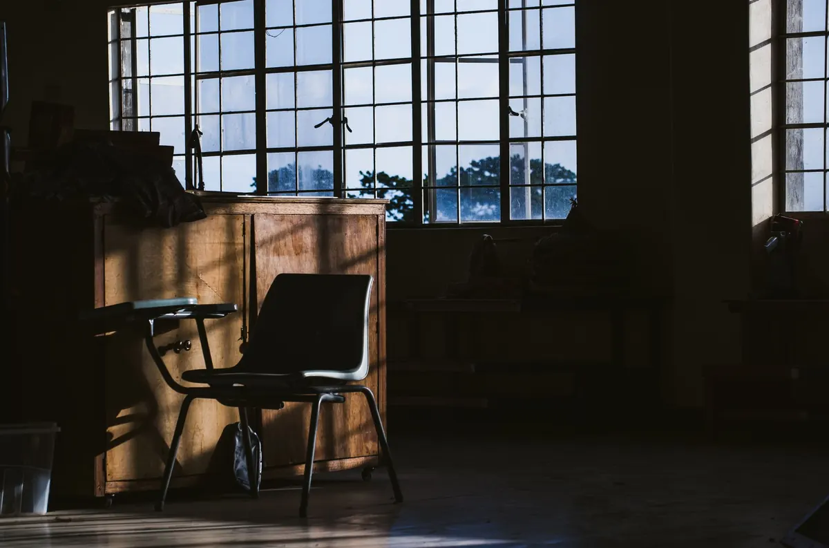
During the day the window is the light source, and your job is simply not to waste it. Keep the area in front of the glass clear, avoid dark matt furniture right beside it, and put anything that needs to be read at to the side of the window rather than directly in front of it.
At night the same window becomes a black rectangle, and the risk is that it turns into a mirror. A single ceiling fixture in the middle of the room will reflect in the glass and make the view disappear. Use three or four low sources instead: a table lamp at elbow height beside the sofa, a floor lamp angled toward a wall, a small lamp on a sideboard, all on warm bulbs and, if you can, dimmers. Keep the room slightly dimmer than whatever is outside and the glass stays transparent. That is the whole trick with a city view.
Mirrors deserve a warning. Hanging one opposite the window is common advice, and it can work beautifully on a side wall, doubling the light without doubling the view. Directly opposite, it competes with the original.
Styling the sill and the frame itself
Keep the sill sparse. One ceramic vessel, a small plant suited to the light, two or three books laid flat. Nothing tall enough to split the view in half, and nothing so numerous that the eye cannot decide where to rest. If the window has a deep recess, a low bench with a slim cushion is a better use of the space than another surface to fill.
Give the frame some attention too. Clean glass, working hardware and well-proportioned joinery are the equivalent of a good picture mount. If something outside spoils one corner of the view — a pole, a satellite dish, a neighbour's extension — you can often crop it out with a sheer panel at that edge, screen it with a tall indoor plant, or soften it with planting outside the window.
A practical order for putting it together
- Photograph the room at three times of day; note the horizon line and the path of the light.
- Decide which single sightline matters most, and mark it on the floor with tape.
- Place seating to protect that sightline, then build the rest of the layout around it.
- Choose the wall colour — borrowed from the view or deliberately quiet — and paint a large sample patch to check it at different hours.
- Hang the pole wide and high, and check that the open curtains clear the glass.
- Add two or three low light sources for the evening before you buy anything else.
- Live in the room for a week. The pieces you stop noticing are the ones that were right.
One last thing worth saying plainly: a room with a great window does not need much. Restraint is the whole design. Every object you leave out gives the view more room to work, and the best compliment a visitor can pay such a room is not to mention the furniture at all.
Photo: Nothing Ahead / Pexels